OnRoad

This case study highlights the importance of user-centered design in improving a troublesome experience that many of us experience on a frequent basis. The goal of this case study on my portfolio is to showcase my design methodologies and journey from conceptualization to finished prototype.

Type

Case Study

Role

UX/UI Designer

Type

Case Study

Role

UX/UI Designer

Artifacts

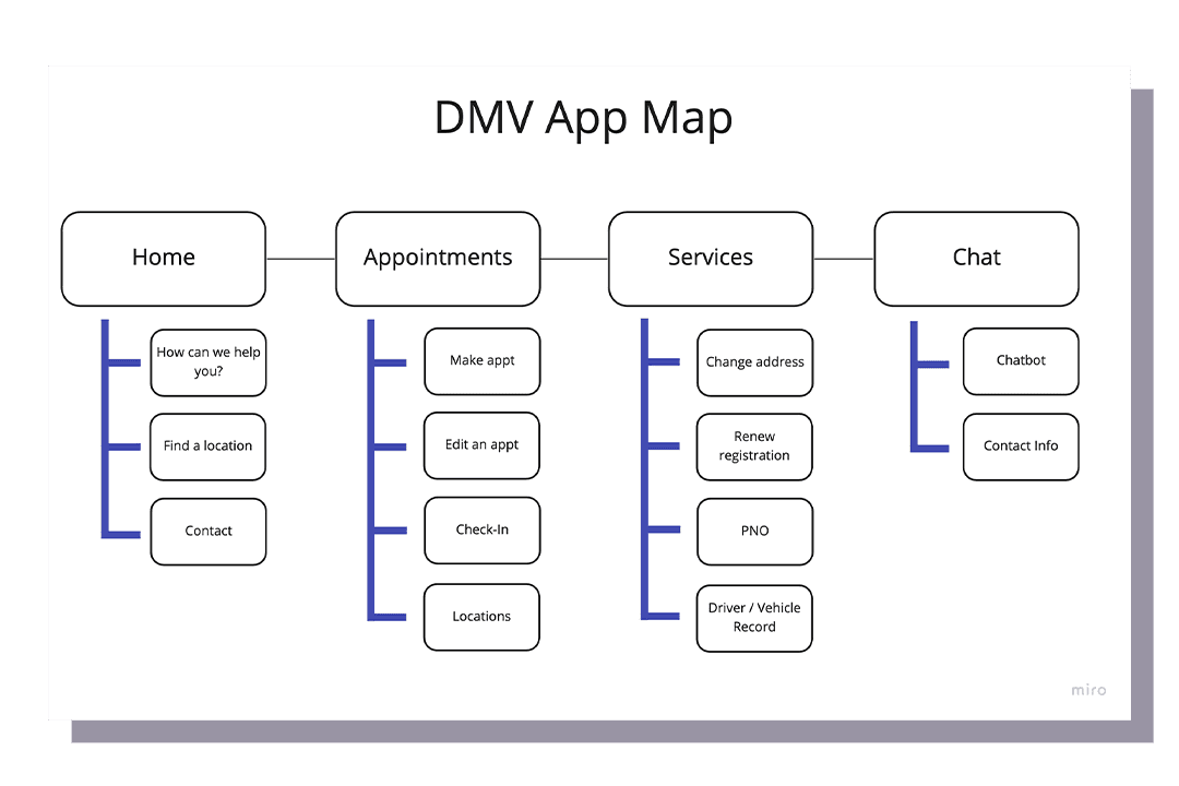
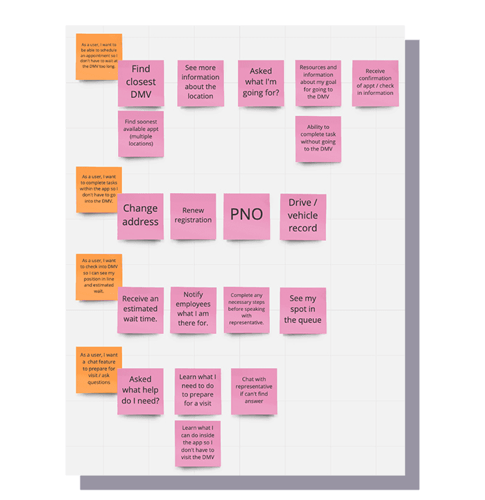
User Stories & App Map

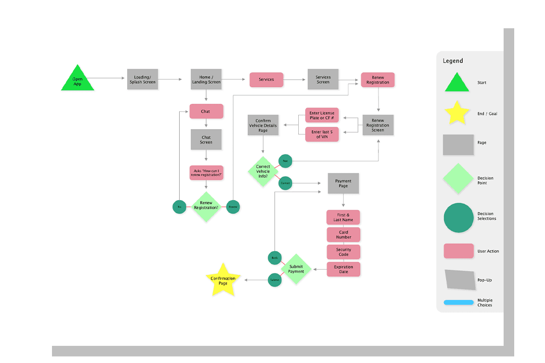
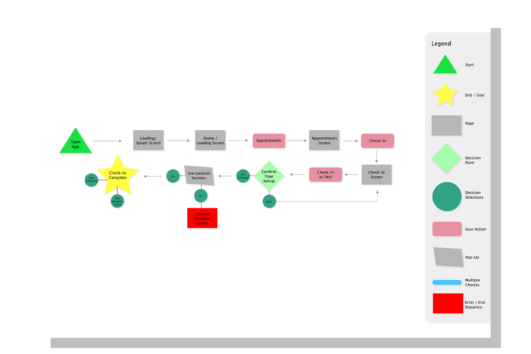
User Flows of Red Routes

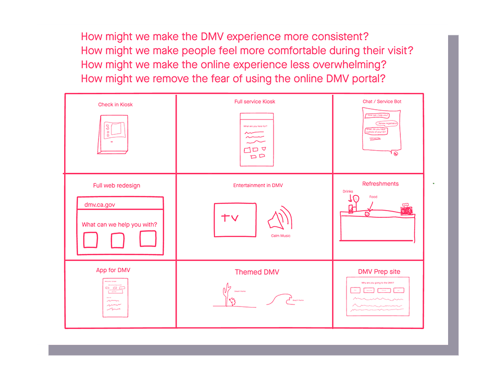
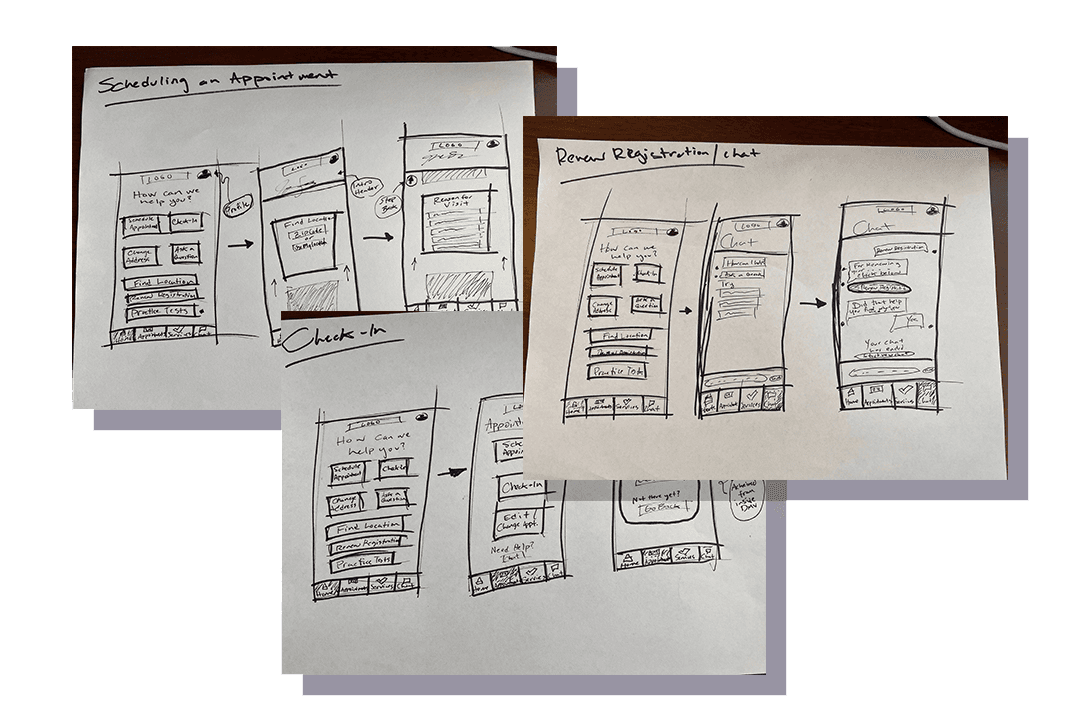
Brainstorming Visualization & Sketches

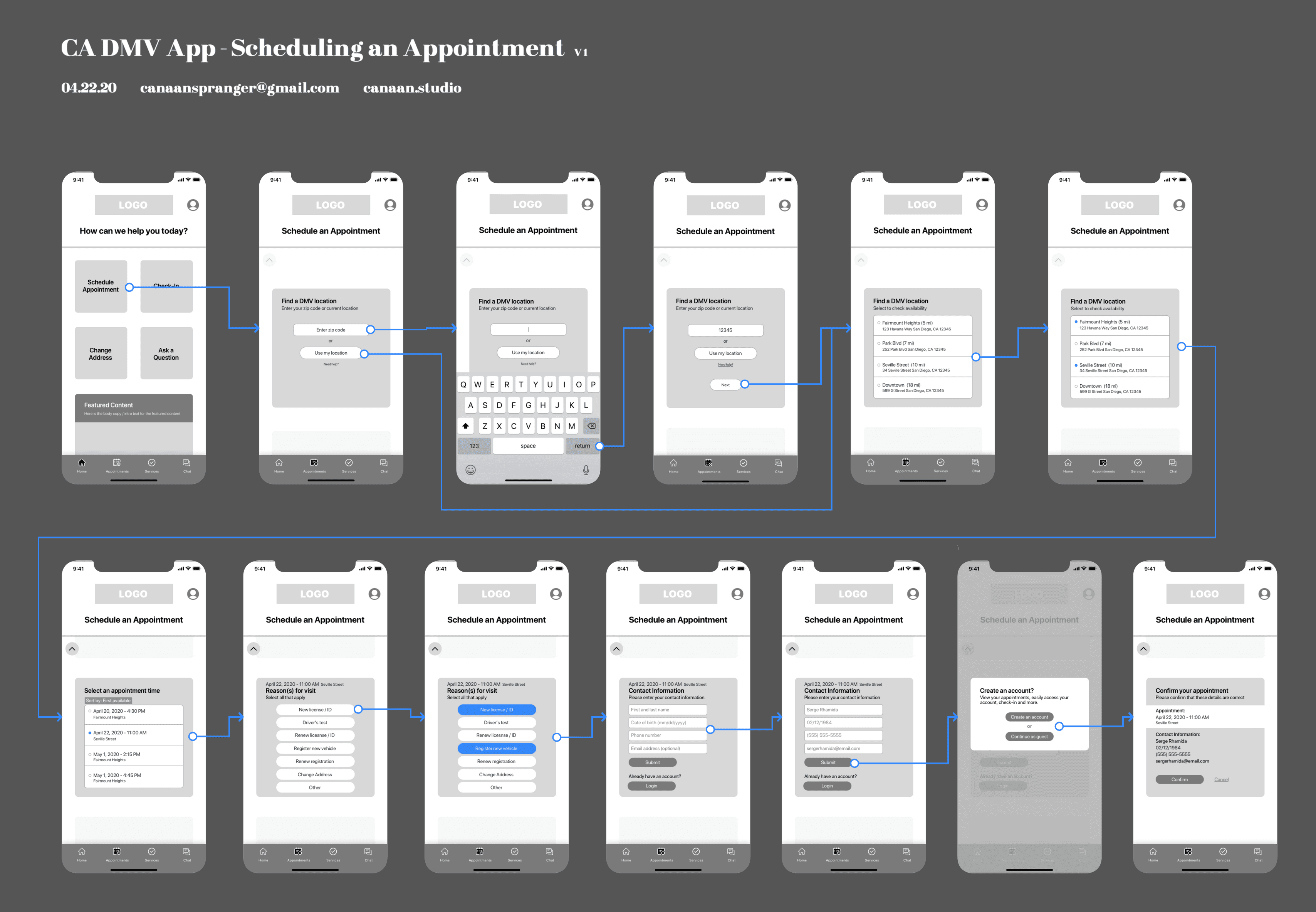
Wireflow of Low-Fidelity Designs

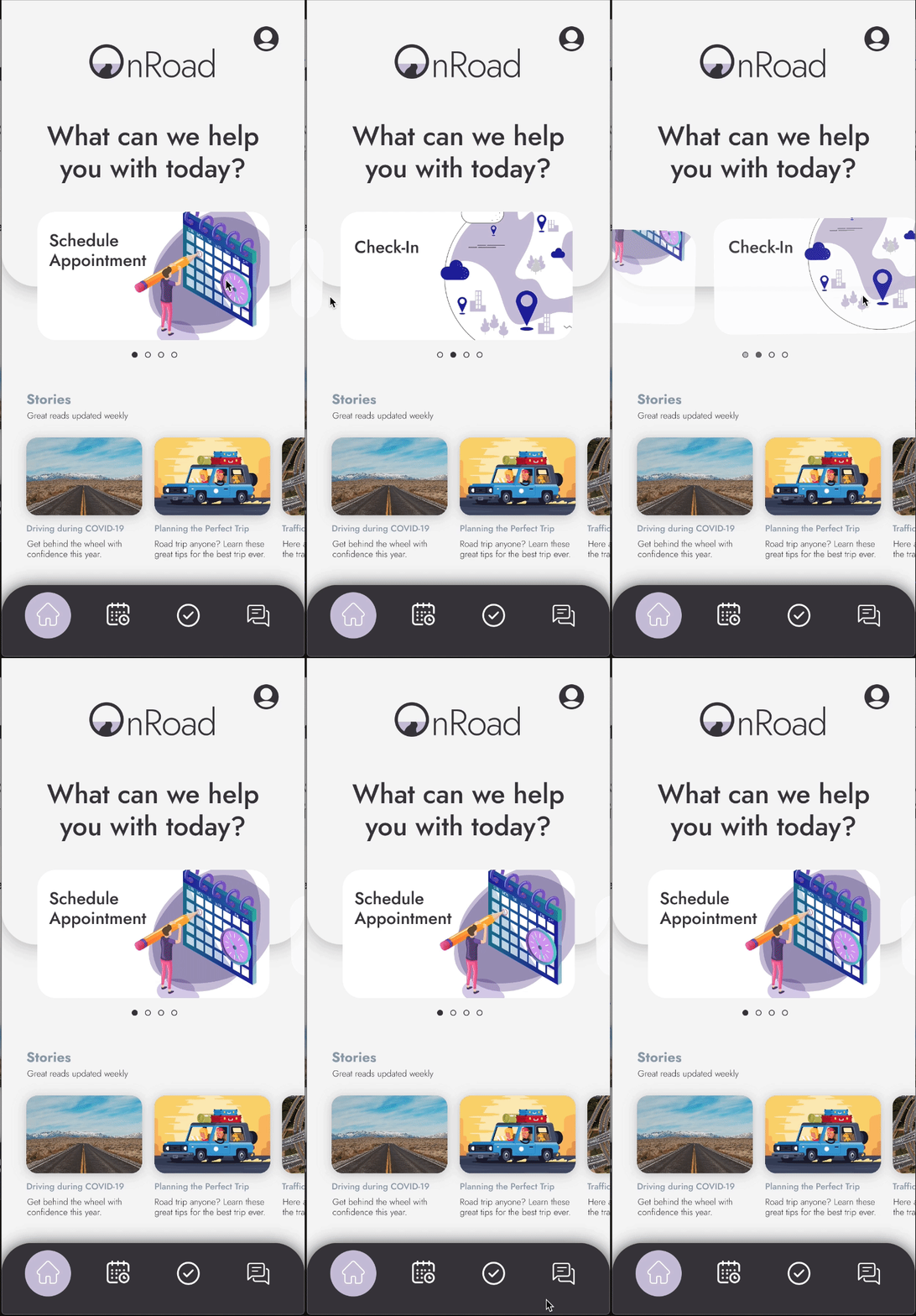
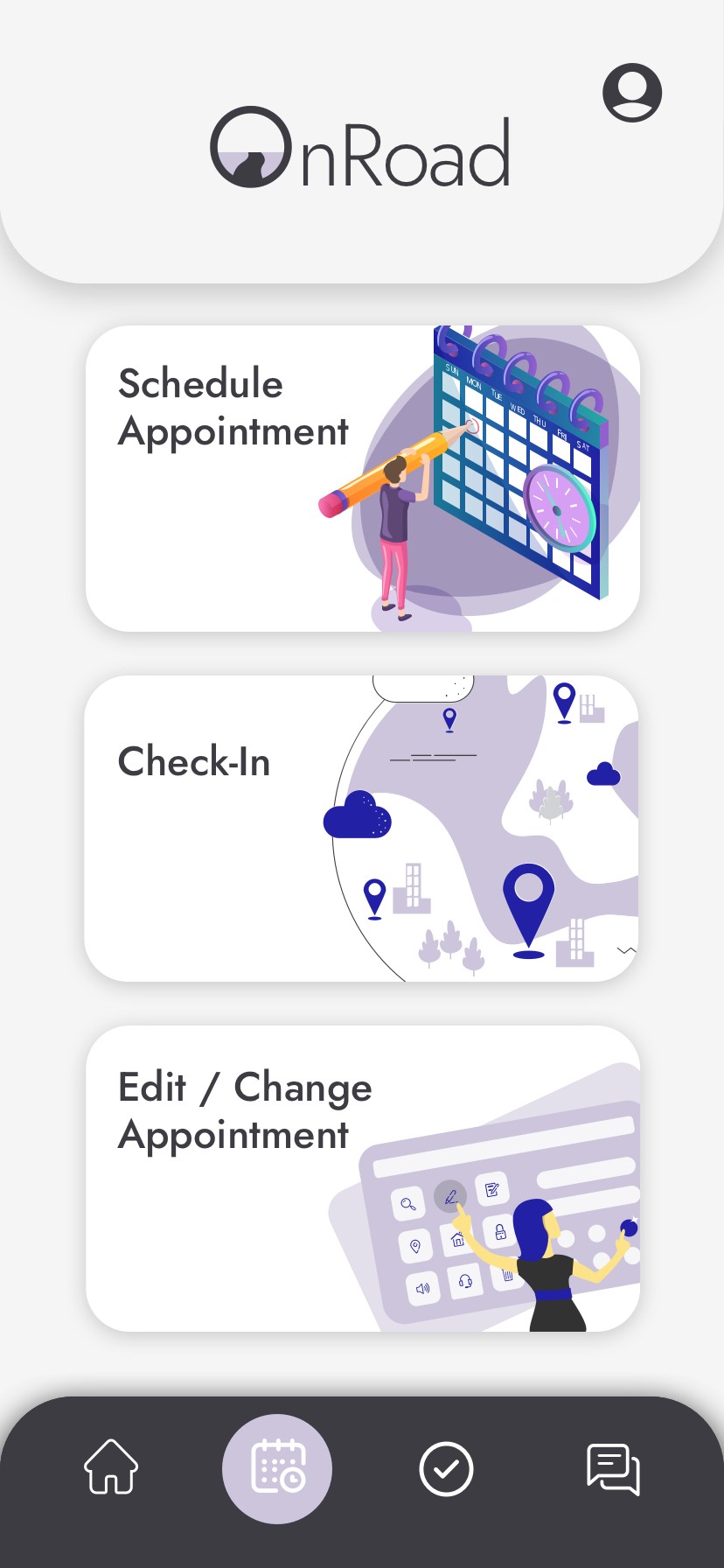
High-Fidelity Designs & Interactions

Artifacts

User Stories & App Map

User Flows of Red Routes

Brainstorming Visualization & Sketches

Wireflow of Low-Fidelity Designs

High-Fidelity Designs & Interactions

Artifacts

User Stories & App Map

User Flows of Red Routes

Brainstorming Visualization & Sketches

Wireflow of Low-Fidelity Designs

High-Fidelity Designs & Interactions

Problem

The DMV is often associated with negative experiences, and this case study aims to address the various challenges faced by users when interacting with the DMV. To find the best solution, it is crucial to have a deep understanding of the problem.

Process

Empathize: I began by conducting secondary research to gain insights into the issues facing the DMV. I discovered that long wait times were a common problem due to the introduction of the "Real ID." Reports also indicated that many users had unpleasant experiences at the DMV, especially in larger cities.

User Interviews: I conducted user interviews to empathize with DMV users. The goal was to understand their feelings, thoughts, actions, and problems. These interviews revealed that the online DMV experience was overwhelming and that many users faced difficulties during in-person visits.

Analysis & Synthesis: After collecting research data, I used methods like affinity mapping, empathy mapping, personas, customer journey maps, and "How Might We" problem statements to analyze and synthesize the information. These techniques helped identify patterns and root issues.

Ideate: With a deep understanding of the problems, I brainstormed creative solutions to address the issues identified during research and analysis.

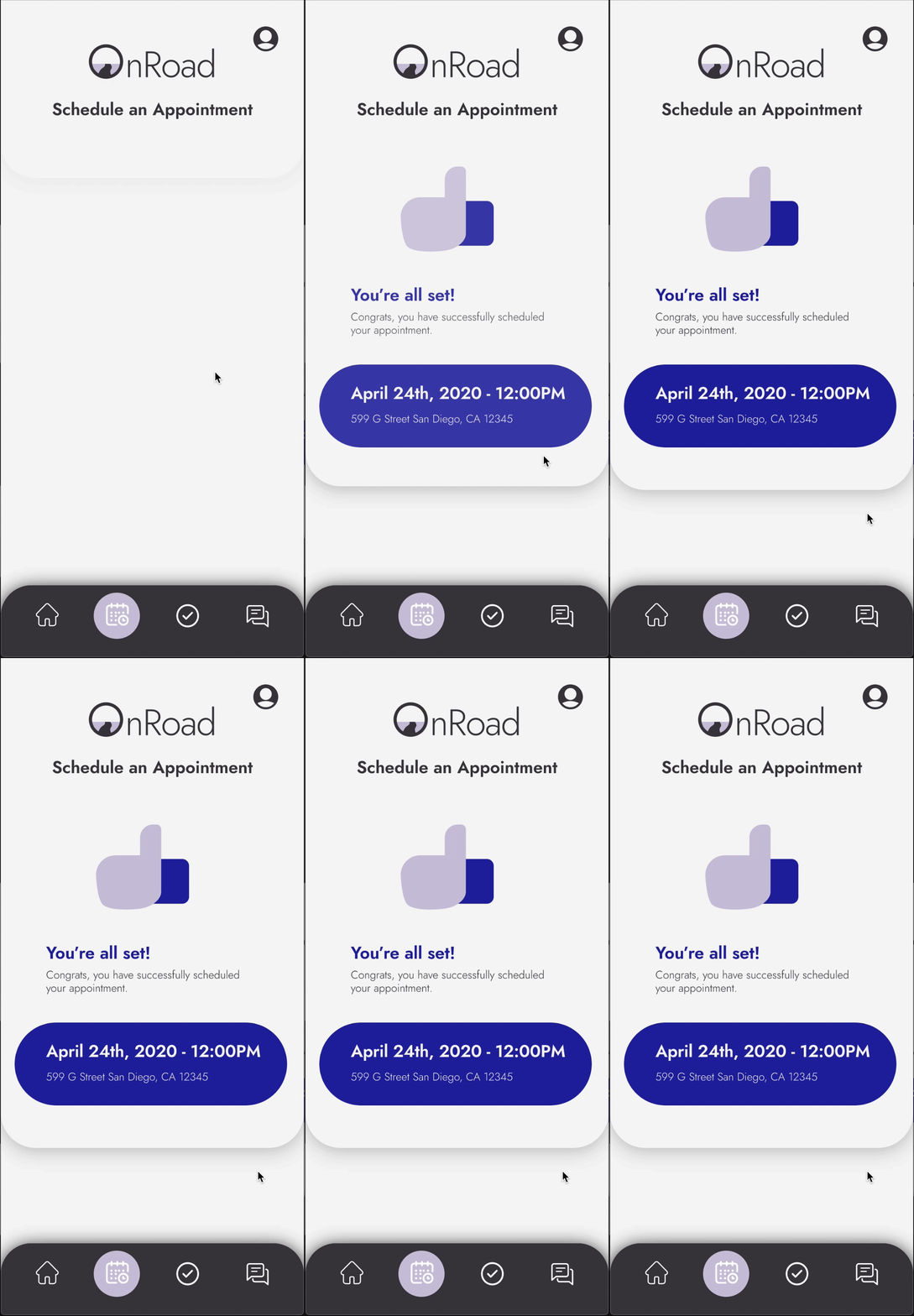
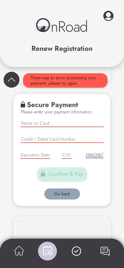
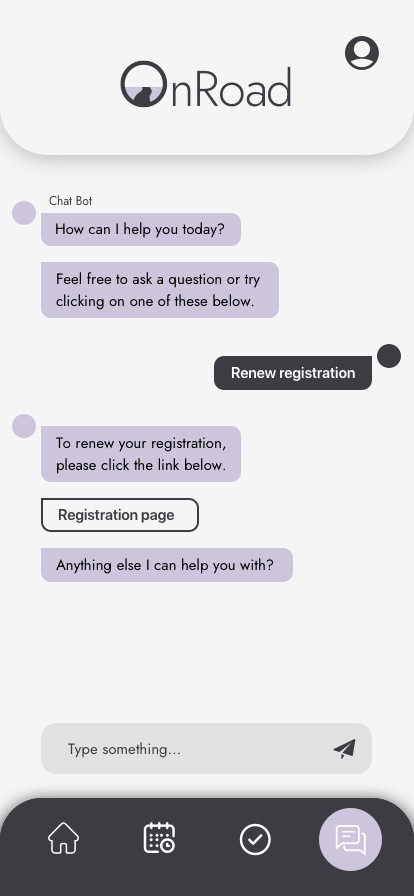
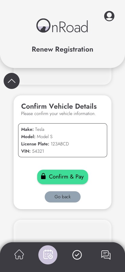
Design & Prototype: I combined the best ideas into a single app concept that aimed to provide a comprehensive solution. The app included features like appointment scheduling, task completion, check-in, and a chat/service bot.

User Testing: To further understand if my solutions addressed the user needs, I tested my hypothesis through unguided task assignments in user tests. These tests validated my research and gave further insight into next steps and iteration.

Outcome

My solution integrated user research, empathy, and creative thinking to improve the DMV experience. The proposed app aimed to make the DMV experience more consistent, comfortable, and less overwhelming for users. It addressed issues related to long wait times, online confusion, and lack of information. The prototype was tested with users, and while there were minor issues with navigation icons and chat functionality, overall, the solution proved successful in achieving its goals. I recorded the time it took to complete these tasks and OnRoad saw a 33% faster completion time in each of the tasks I assigned.

My solution integrated user research, empathy, and creative thinking to improve the DMV experience. The proposed app aimed to make the DMV experience more consistent, comfortable, and less overwhelming for users. It addressed issues related to long wait times, online confusion, and lack of information. The prototype was tested with users, and while there were minor issues with navigation icons and chat functionality, overall, the solution proved successful in achieving its goals. I recorded the time it took to complete these tasks and OnRoad saw a 33% faster completion time in each of the tasks I assigned.

Let's work

together.

canaanspranger@gmail.com

Let's work

together.

canaanspranger@gmail.com

Let's work

together.

canaanspranger@gmail.com