Context
MoneyCents, a subscription management company, sought to develop a mobile app that empowers users to track and control their recurring subscriptions, aiding them in understanding their spending habits and saving opportunities.
Problem
The challenge was to create a mobile app enabling users to visualize, manage, and receive notifications about their recurring subscriptions. Competitive research provided insights:
Users favored mobile platforms that were clean, elegant, and user-friendly.
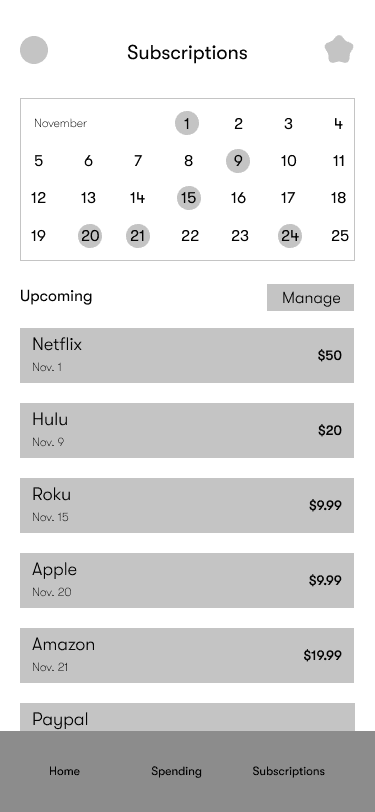
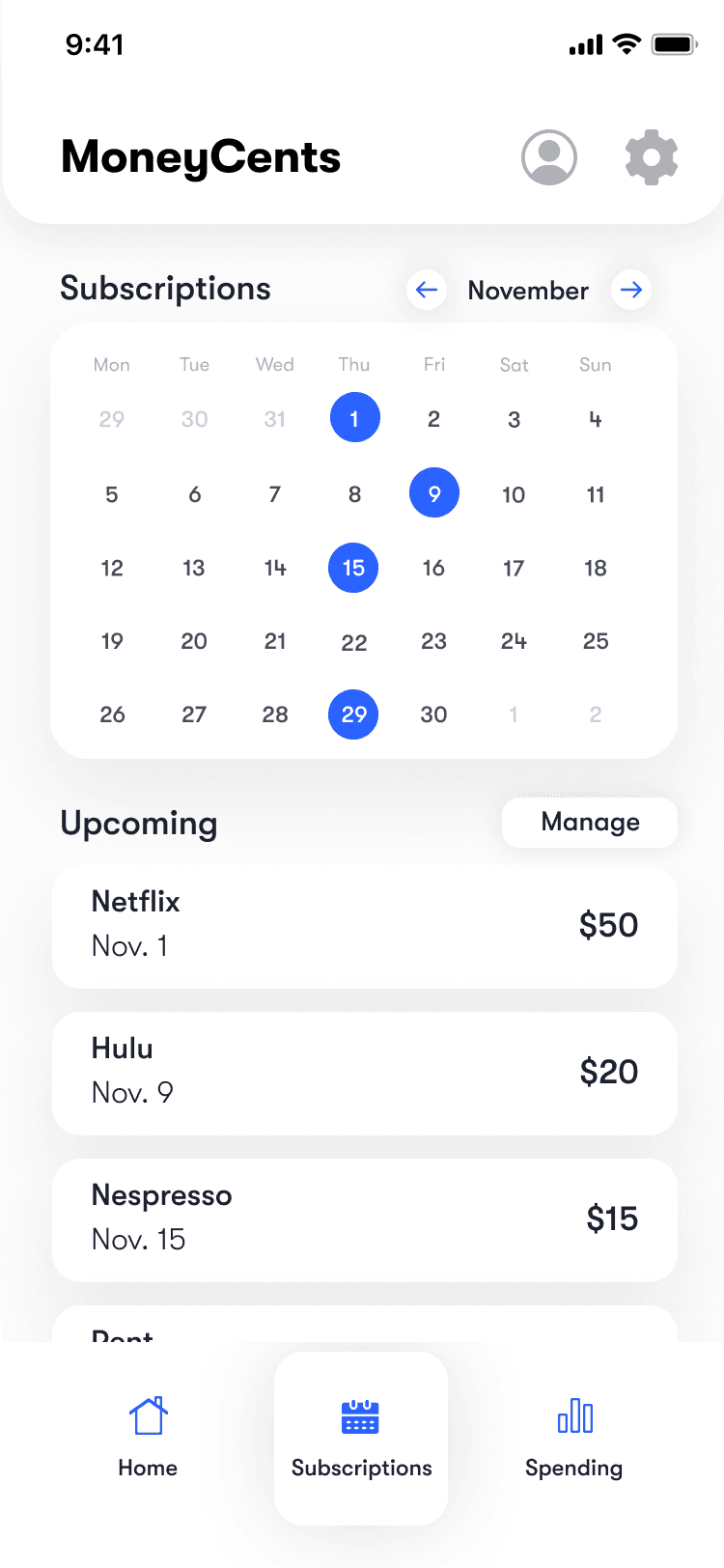
The absence of a calendar view for upcoming subscriptions was a common user complaint.
Customizable alerts for notifications were highly valued.
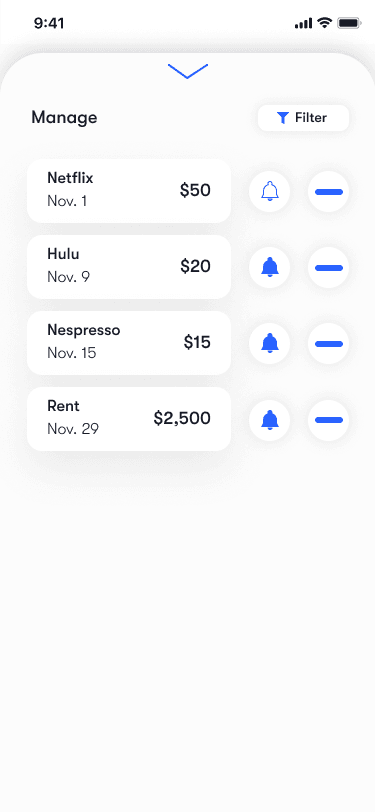
Cumbersome unsubscribe processes on existing platforms needed improvement.
Process
To tackle this challenge, I started with a well-structured plan, crucial given the limited time and budget constraints. Color-coded categories helped organize tasks, and I included rationale for chosen methodologies to communicate effectively with stakeholders.
Competitive Research: Due to project scope and constraints, competitive research was the chosen research method. It efficiently revealed insights into direct competitors, guiding potential solutions for MoneyCents.
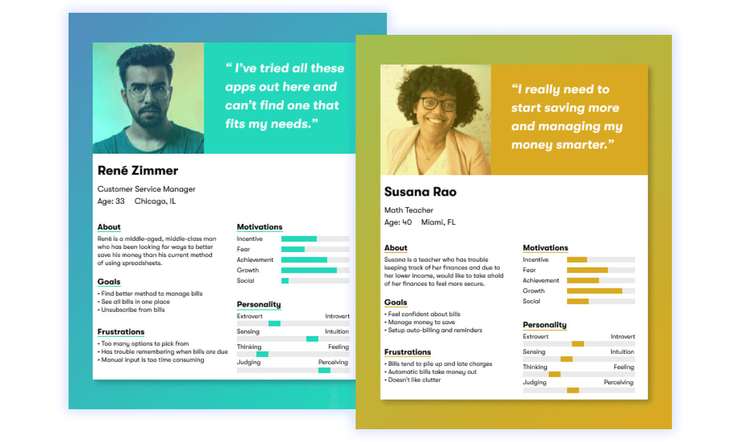
Personas: Findings were distilled into personas, providing a tangible representation of user characteristics. These personas served as a constant reference throughout the project, enhancing user-centricity.
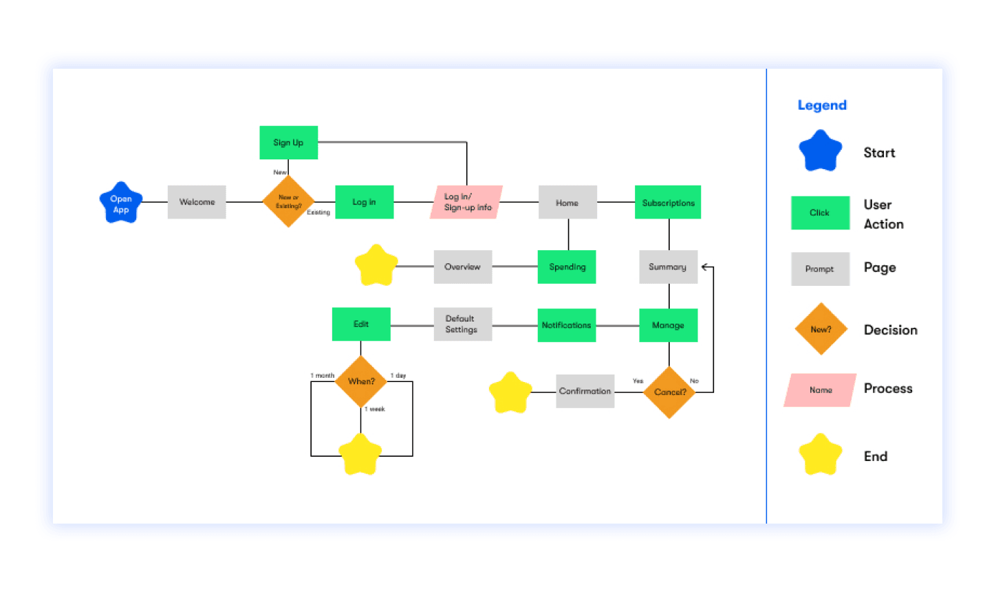
User Flows: With a clear understanding of the problem and user personas, I mapped out the app's flow. The emphasis was on simplicity and elegance, ensuring users could easily view subscriptions, unsubscribe, and receive renewal notifications.
Sketching: I experimented with a sketching tool that incorporated phone borders and grids to maintain proper scale. This tool facilitated a more accurate representation of design elements in wireframes and high-fidelity designs.
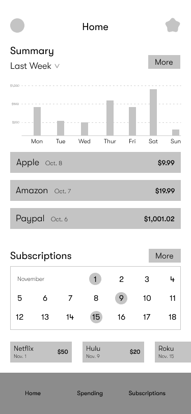
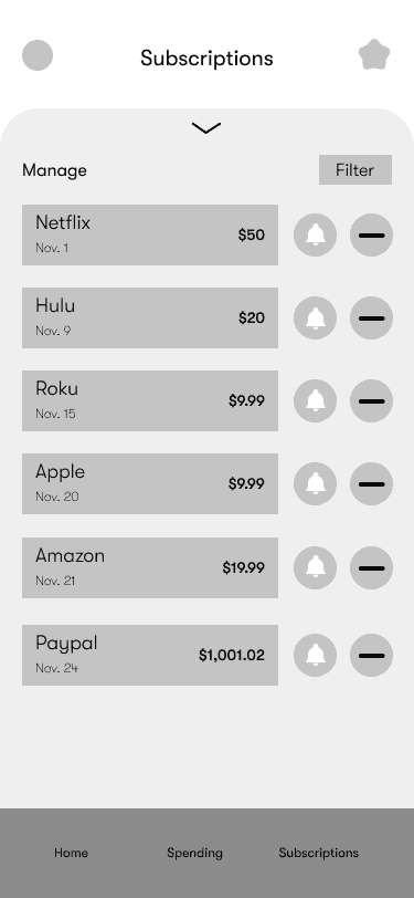
Wireframes: Leveraging sketches and user flows, I created low-fidelity wireframes to enable early testing, crucial within the project's timeframe.
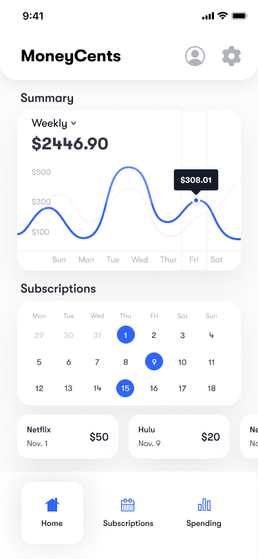
UI Design: Building upon wireframe testing results, I transitioned to high-fidelity UI design, focusing on improving subscription cancellation and related flows. Subsequent user testing informed iterative design enhancements.
Outcome
Wireframe User Testing: Early wireframe testing with five target audience users provided valuable insights. Users attempted to unsubscribe by clicking directly on subscriptions, highlighting a need for a clearer unsubscribe process. Additionally, users desired filter options for subscription lists and found the home screen slightly cluttered.
High Fidelity User Testing: Transitioning findings from wireframe testing to high-fidelity designs was time-intensive. However, it resulted in a user-friendly, elegant MoneyCents app. Key findings from high-fidelity testing informed the final design:
• The unsubscribe button needed clarification to avoid confusion.
• The flow after unsubscribing from a service required further user control.
• Users preferred the ability to manage subscriptions directly from the subscription screen by clicking on upcoming transactions.
In conclusion, through a well-structured process, I successfully designed an intuitive mobile app for MoneyCents, addressing subscription management challenges and enhancing the user experience.

